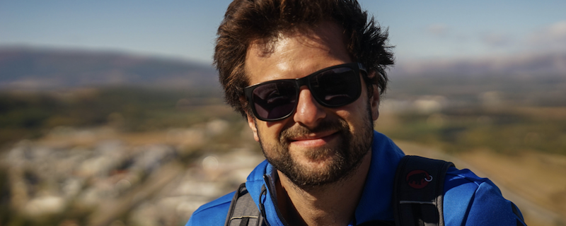
Henrietta Shirley talks to data strategist and infographic designer Yannik Messerli about mastering his art, the analysis and artwork of data.
Data is one of the most powerful tools in the world, but it’s our ability to understand, shape and translate it for others that is invaluable. These days we are saturated with information and often wary of its reliability, and it is in this sceptical environment that data has become synonymous with truth-telling and transparency.
With almost 2.9 million views on David McCandless’s Ted Talk The beauty of data visualization and over 199,000 Instagram followers on data illustrator and journalist Mona Chalabi’s profile, it’s clear that our thirst for assessible and creative representations of data has become more mainstream. We want to be able to read the world around us and be sure of where we stand.
Yannik Messerli’s designs look to move beyond data visualizations as singular images and messages. He wants to create an entire map of information, one that includes more connections, answers more questions, and builds a world that can be explored. Messerli’s infographics update independently, in McCandless’s words, these are ‘living images’—holding and compressing oceans of information and knowledge, whilst incorporating movement and interaction as the tool to greater understanding.
Messerli builds his own software to streamline data. He sifts through it, cleans it, analyses it as though he’s looking for gold, and in today’s world that’s exactly what it is, but as he describes, it’s also what you do with it—how you captivate.
What interests you creatively about data?
I actually started my career as a designer, but I didn’t find it technically challenging enough to stay. I found signal processing studies much more challenging, but I got frustrated by the quality of its visuals. That’s what’s been so incredible about working with The Tao of Excellence.
Ordinarily, you’re asked to produce either complex pipe work or polish the joints, so it’s rare to find a place that wants to combine both. Tao are looking for really complex and technical workflow designs, but they also want creative visuals to represent the findings.
What elements do you think make a great data visualisation?
The most important part is revealing the information. Data holds a lot and usually you’re only interested in one portion of it. It’s important to identify that early on, and then expose it in clearest way possible. The best data visualisations are when people can pass by, look up and say, “oh yeah, of course.” My bonus is when people add “this is really pretty by the way.”
How do you like to work or what is your process like?
I’m rarely familiar with the field I’m working in, so the first step is always speaking to the experts. Then, after some initial analysis, I usually setup a pipeline that will gather the data, store it in one place, clean it and create subsets of data so that I can analyse the information more easily.
That process of analysing the data varies a lot from project to project. Generally, it involves multiple iterations that I test with experts in the field. I show them some ugly and numerous data visualisations and then work from feedback. Eventually, one or multiple master data visualisations evolve that will exhibit the most important or interesting information.
Then I start the creative work. That’s built using one robust data set. From that set, even if I already have some graphs or visuals, I start from scratch and begin coding interactive visualisations. I tend to avoid static or manual visualisations because data changes so often. Visuals need to be able to update, otherwise it’s a real pain to do manually.
For some projects, this process needs to then be streamlined. For that I’ll develop an entire application capable of fetching the data—cleaning it, processing it (accounting for human interaction)—and producing the final data visualisation too.
What do you always keep in mind when you create a work?
Three things: the message we want to share, the audience and the support on which we will deliver the visualisation.
What do you think the sense of movement and exploration in your work brings to a visualisation?
Interaction is an important part of a data visualisation. Often data is too complex to be represented statically—there are too many dimensions, or a large data set will often dilute or hide the information it contains.
The process of interaction actually helps to reveal the data. It can illustrate the more complex data relationships, for example, in between the different dimensions of the data. A static graph just can’t capture that.
How would you describe your style?
I actually avoid developing a personal style. I don’t want to keep producing the same approach in design for every creation. On the contrary, I find it far more interesting to develop a site-specific style from project to project.
I like to think about what will lift the project, and I believe that the result will always be better because it’s closer to the audience’s own style. That closeness enhances their sense of clarity when they read the graphics, and therefore the data message too.
Where do you draw inspiration from?
As with the style of the design, I don’t have a contained source of inspiration. My true inspiration depends on the project and usually appears during the experimentation phase—it’s an expression of the work I’m doing within the project.
In terms of the theoretical bases of my work, I’ve been influenced by Edward Tufte’s The Visual Display of Quantitative Information, and I was really impressed by D3.js—since then, I’ve followed all Mike Bostock’s work. I’ve also listened to conferences by Prof. Jeffrey Heer and own books by David McCandless.
Is experimentation an important part of what you do?
I think experimentation is important in any aspect of life. In a way with this work, experimentation comes from being completely in the dark. The raw material I’m working with is a huge data set. It’s a black box you have to enter and explore. After a while, you start to have some idea of the space you’re in, you develop a hypothesis about it, and from there you begin to shape the message.
That message needs to be strengthened by and reflected in the data. Often, the message isn’t quite right, so you’ll have to start all over again. That’s the experimental part—the trial and error. If you were a genius, with lasers instead of eyes, perhaps you’d be able to immediately process the millions of data records. Otherwise there’s no other way. You have to experiment.
Where do you find the data content for your visualisations and how do you ensure its reliability and transparency?
Most of the time the data comes from the field experts. They bring projects and questions with a lot of data that they can’t process (usually because it’s too big), but it is rare that the data will be either reliable or transparent.
The cleaning process aims to address the reliability. Reliable data is extracted from the set and any incomplete data is either discarded, or sometimes, where possible, it’s manually completed or completed by other data. In the end, small errors or discarded data should not change the message if the data set is large enough.
Transparency of the data is only a concern when the visuals are shown publicly. In customer’s projects, it’s my process that needs to be transparent. I put a lot of effort into explaining in the simplest language possible the process I went through to create the work. That simplicity builds confidence in the message I deliver. The better a field expert can understand it, the better they can help me improve upon it.
What is the biggest challenge you face in the field of medical devices?
The quality of the data. Digitalization in this industry is still in its early stages. Information is often stored in a format where the data can’t be extracted, such as on hand written, scanned or printed documents.
Why is context so relevant when analysing data?
It’s often the case that data contains much more information than what is required or of interest. If you know the context, the iteration process for analysing the data can be significantly faster.
Data can also be misleading if you don’t know the context. It has so many dimensionalities that it’s easy to find a pattern or correlation where there isn’t one. I remember once seeing a chart showing a connection between the consumption of margarine and global happiness, both curves appeared completely attuned, but in reality, they have little to do with one another.
Do you ever collaborate on projects?
Always! I’m not a subject expert, I work for those experts. Without them, I have no data to crunch, no message to deliver, no audience to address.
How would you describe the relationship between art and science in your work?
Personally, I find it really stimulating bouncing my head against all these complex technologies and then using them to create a stunning visual. But I always make sure that the final result isn’t driven by the technology. The technology needs to serve the visual!
Phone
+41 52 685 51 65
Email
meetus@taoexcellence.ch
Did you like this article? Follow us on LinkedIn and Twitter!


